I drew a recommendation panel headed "Strongest, 3 tied."
It looked good. It also asserted something I hadn't measured.
The research so far had compared estimators over many draft situations. The panel needed a different answer: how certain was I that these particular three heroes belonged together, for this particular request?
A tidy mockup had turned an unresolved statistical question into a label.
The Difference Needs Its Own Uncertainty
My first band boundaries were constants chosen while drawing the interface. They didn't acquire meaning just because the model could produce scores on both sides of them.
I replaced that idea with a comparison to a band leader using estimated score errors. In the early one-enemy tests, the top band had a median size of one. The elaborate grouping usually contributed very little to the page.
But there is a limit to what that check establishes. Whether two candidates are distinguishable depends on the uncertainty of their difference. Two separate error bars aren't enough: their estimates share data and can be correlated. The implementation combines squared errors as though that covariance were zero. Its table estimates also approximate the dependence among pair cells.
Above the hybrid switch, the error proxy changes again: it is the spread across three training seeds, not the sampling uncertainty of the data. That is useful for noticing sensitivity to initialization, but it isn't a complete confidence interval for a candidate's score. In the inspected implementation, that spread is also pooled over ranks even when the requested score is bracket-specific.
So I removed the large default bands and used smaller score-gap indicators and uncertainty hints. I should not describe those hints as statistically certified ties, or claim that the remaining leader is proven to be the best pick.
The interface had asked a worthwhile question. It had not supplied the answer merely by giving me somewhere attractive to print it.
The Dropdown Was Already in the Model
The second question came from the header's "all brackets" label. Why should a player at one end of the ladder get an answer averaged over everyone?
I initially thought that might mean training separate models. The artifact already had bracket-conditioned hero-strength terms. Selecting a bracket could read the corresponding slice instead of averaging slices by population share. It was a different input to the existing estimator, not a new training run.
The recorded validation check compared the historical outcome rate of each version's top-ranked eligible hero against one enemy. Candidates needed at least 120 matchup observations in that bracket, and a context needed at least 20 eligible candidates. Results were averaged across enemy contexts. This was an earlier build, not a new evaluation of the final refitted artifact.
| Bracket | Change in top-choice historical-rate score |
|---|---|
| Herald | +0.371 percentage points |
| Guardian | +0.462 percentage points |
| Crusader | +0.203 percentage points |
| Archon | +0.121 percentage points |
| Legend | Approximately zero |
| Ancient | +0.717 percentage points |
| Highest observed bracket: Divine | +1.604 percentage points |
This is an observational comparison, not sixteen additional wins per thousand users who follow the tool. The players who chose those heroes are not a random sample of the people who might be advised to choose them. The comparison also has fewer eligible candidates in some brackets than others.
The old label "Divine/Immortal" overstated the population. This snapshot has no separate Immortal-average-rank cohort. Its highest observed bracket is Divine; I can't claim to have measured an Immortal-specific benefit.
Nor does this mean every part of the estimator varies with rank. In this build, shrinkage retained bracket-specific hero strengths but pooled the pair terms. That is a fitting choice supported by these data, not proof that counters and synergies are identical at every skill level.
The result made the selector worth offering. It did not justify comparing +1.604 percentage points on this top-choice statistic with +0.00086 concordance from Part 11 and calling the dropdown eighteen times more valuable. Those are different metrics on different question populations.
The Questions Behind the Selector
One useful follow-up was whether the model discriminated winners differently by bracket. On complete drafts, the reported AUCs ranged from about 0.618 to 0.622. AUC asks how often a randomly chosen winning row receives a higher score than a losing row, with ties split evenly.
That is not 62% match-classification accuracy, and similar AUCs don't mean the draft explains the same fraction of outcomes at every rank. They describe this estimator's discrimination on these populations. The overlapping intervals also do not constitute a formal equivalence test.
I then looked at how individual hero-strength estimates changed across the bracket slices:
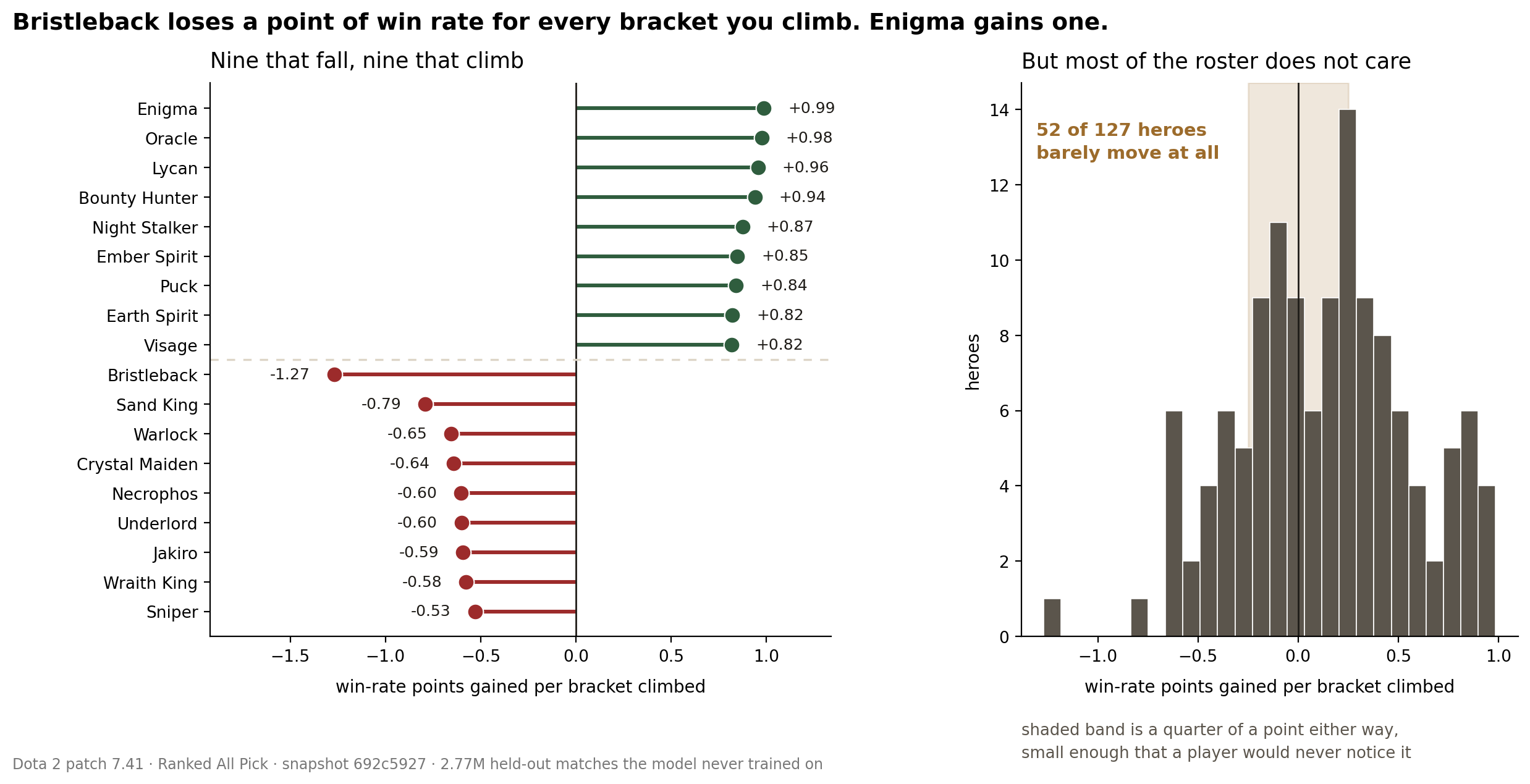
Bristleback and Enigma again moved in opposite directions. But these are slopes through fitted log-odds terms, converted around even odds, not a measurement of what gaining one rank does to the same player's win rate. The familiar names make the result legible; they don't establish the mechanism.
And 52 of 127 is about 41%. My original claim that "most heroes don't care about rank" was both an arithmetic mistake and too broad an interpretation of a small fitted slope.
Let the Interface Ask Questions
The bracket selector was practical progress without another architecture. The tie panel was useful for the opposite reason: it exposed a claim I wasn't ready to make.
That is what building the interface added. It forced the research to answer questions at the size a person encounters them: this bracket, these heroes, this gap between candidates. An average over the whole experiment was no longer enough to fill in the screen honestly.
The next unresolved field was the small row of positions beside each hero. It looked like something I should be able to infer from match statistics. It turned out to require a different kind of evidence.