There are a handful of small, recurring annoyances in my daily workflow that I've just learned to accept. One of the biggest has always been the ridiculous dance required to get a photo from my phone to my PC, or a snippet of text from my browser to my phone. The usual solutions have always irked me: emailing myself, finding a USB cable, or using a bloated cloud service that takes forever to load (and then it asks you to do 2 factor authentication). Come on.
This is the kind of inefficient process that drives an engineer crazy. So, I decided to fix it. I carved out a weekend to build "Paste": a private, self-hosted web app to solve this one problem, and solve it well.
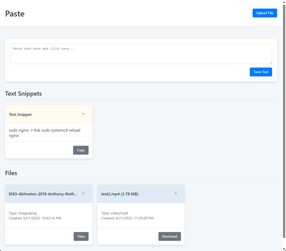
The goal was extreme simplicity. A big text box for copy-pasting. A dropzone for files. That's it. The interface needed to be clean, fast, and completely responsive, working just as well on my phone as on my desktop. I built the first version in a couple of days. It had the core functionality, a clean UI, and it felt great to use.
From Prototype to Polish
Who am I kidding. Of course I'm going to over-engineer the crap out of this.
Building the initial working prototype is always going to be the easy part. Turning it into a robust, secure, intuitive service is where it takes real design and thinking. This is a shorter blog post than usual, and I'm just here to share a few interesting challenges and considerations I found along the way.
First up was security. In a moment of self-auditing, I realized my file upload logic had a glaring hole. If a malicious user (there's no other user, but pretend) tried to upload a file named ../../some/other/path, the server would happily obey, potentially overwriting critical system files. This is a classic Directory Traversal vulnerability. The fix was straightforward but non-negotiable: I built a robust sanitization process to meticulously inspect and clean every incoming filename, ensuring it was just a name and nothing more.
Next came a file size limitation that caught me by surprise. I dragged a 5MB video file onto the page to test an upload. It failed instantly with a Request Entity Too Large error. This was confusing, as I had set the application's own upload limit to 1GB. After a careful series of tests to find the root cause, it turns out the problem wasn't in my code implementation at all. It was the Nginx reverse proxy sitting in front of the application, which has its own, much smaller default limit to prevent denial-of-service attacks. A quick tweak to the Nginx config taught the proxy to allow larger files through to the app. It's a good reminder that application code itself is only one part of the stack.
Finally, there was the user experience polish. The initial design was a single, democratic grid where a five-word text snippet held the same visual importance as a 500MB video file. It was definitely functional, but after using it for a while I didn't like it. The primary use case (quick text pasting) was getting buried. The fix was to rethink the entire information architecture. I decided to split the UI into two distinct sections: a high-priority area for "Text Snippets" at the top, and a separate grid for "Files" below. To reinforce this, I gave their headers a subtle color-coding: a muted yellow for text snippets (think sticky notes), and a desaturated steel blue for files. It's a simple change, but it transformed the usability by creating a clear visual hierarchy that guides the user's eye.
And that's it! It's a simple utility, born from a common frustration. It was prototyped quickly, but hardened with the attention to detail that makes a personal project reliable enough for daily use. To me, there's nothing more satisfying than building the exact tool I need, tailored precisely to how I want to use it.